11 Ways to Build an MVP
Startups are inherently facing a lot of uncertainty. No wonder 90% of them fail. Out of those ninety per cent, 42% fail because they are providing a solution for which there is no market need. But how can we avoid this?
The best way is to try and reduce the level of uncertainty. We should formulate what assumptions must be proven correct for our product to succeed and then test these assumptions with users. This process is called validation. And one of the most important tools of validation is the MVP.
Frank Robinson first mentioned the MVP or minimum viable product in 2001, then familiarised by Steve Blank and Eric Ries. By definition, an MVP is "a product that has the necessary features to solve a user's need and nothing more". But this definition leaves out the very essence of an MVP. But hold on to your horses!
Why am I using the term MVP in the first place? I know you've been closely following my previous articles, so you must've noticed that I started using the term MVP again in this article, although I even wrote about the reasons for which I'm not too fond of it. The truth is, I needed a good clickbait title. And let's be honest, "11 ways to build a prototype" doesn't have the same ring to it 😅 .
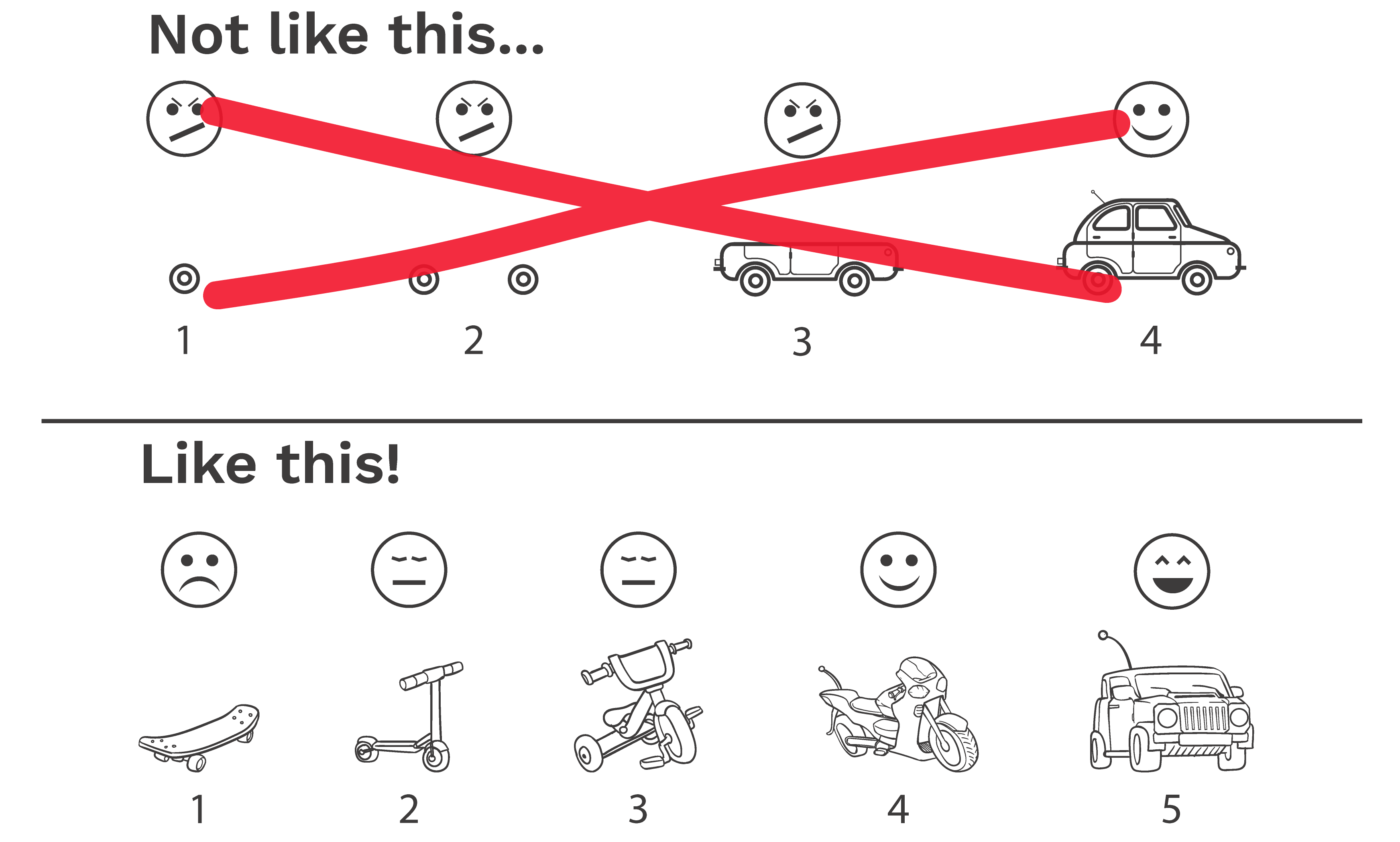
Joking aside, this gives me an opportunity to emphasise what's wrong with the definition above and the term MVP in general. Let's take a look at Henrik Kniberg's (ex-Spotify) illustration below.

The top row shows us how to build a car in 4 steps by always adding functionality to the product. Let's imagine how testing this with users would look like:
– Hi, here's a rear wheel!
– What am I supposed to do with this? I wanted a vehicle to take me from A to B!
Well, this didn't go as expected. But we know we'll get there, so we move on, adding new features.
From here on, we're going to get closer to the final product with every step. But users will still not understand how this product will take them from A to B, meaning they won't understand our value proposition. This also means they won't be able to give us any feedback, so we will not decrease the level of uncertainty surrounding our product, and, ultimately, we may end up stuck with a finished product that nobody wants.
My first issue with MVP as a term is that it's easy to misinterpret the word "minimal". It's not enough to build a minimal set of features as an MVP. We need to create a solution that delivers the entire value proposition.
In the second row, we can see an entirely different approach. Even in the first step, the skateboard already delivers our value proposition since it takes us from A to B. This allows us to gather user feedback and validate our assumptions. In the following steps, we'll be able to tinker with the product based on the feedback we received.
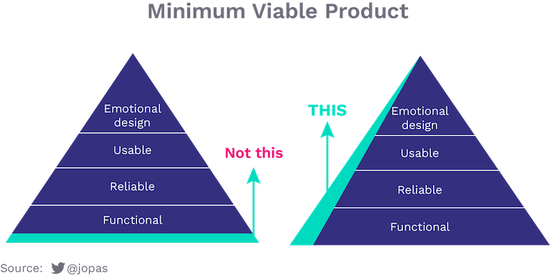
It's important to note that the value proposition includes not only functionality but also reliability, user experience or even the way people will emotionally connect with our product. We must consider all of these aspects when building an MVP.

Eric Ries's definition of an MVP, which states that "an MVP is that version of a new product which allows a team to collect the maximum amount of validated learning about customers with the least effort", is much closer to being the right one. But I still have a problem with it. The fact that it calls an MVP a product.
Instead of creating the MVP with minimal effort, people spend too much time perfecting their MVP. It's human nature, after all: we're all configured to build, to create. It's hard to stop. Because of the word "product" in the name and the definition as well, many tend to stop at nothing short of building something finite.
This phenomenon is further magnified when stakeholders with no lean product development experience are involved. In such cases, many features make it into the MVP, which have no relationship whatsoever with the value proposition. I call these features glitter.
Another issue with "product" is that it leads people to think that we have to build a tangible product (and because of this, they skip necessary validation steps like problem validation or problem-solution fit). Many MVP types allow us to test some assumptions regarding our product but are not tangible, like the concierge experiment or built way before the actual product, as the smoke test. These MVPs are called no product MVPs.
Because of the issues mentioned above, I use the terms prototype or experiment instead of MVP. Now, let's explore the 11 ways to build a prototype!
No Product Prototypes
#1 Smoke Test
A smoke test is a cost-effective tool to gauge buyer intent among users, making it a popular test to run during the product-market fit phase.
A smoke test is nothing more than a landing page, which showcases our value proposition, the advantages of our product, and its core features. Most importantly, it displays the price of our product and a buy now button. Yes, a buy now button, even if we don't have a product yet.
Of course, no actual financial transaction is going to occur. After clicking the buy now button, we'll let the customer know that the product is unavailable. That's how this experiment got its name. The pretty landing page was just a smokescreen, hiding our real intent: to acquire information about buyer interest. The fact that users commit themselves to buy by pressing the buy now button is the strongest commitment we can get.
Another name for the smoke test is the fake door test since we lead users through… well, a fake door. But if we have already led them through, we should make sure we don't let them go either. Ask them to subscribe to a newsletter to inform them of future product developments. To ease their disappointment, we could even offer them some early-bird discounts if they come back and make the purchase when we're ready.
There are many tools to build a landing page. The easiest way is to use a page builder tool like Squarespace, Wix or Strikingly. You could tailor a WordPress theme to your needs if you require more customisation.
Don't forget to bring visitors to your landing page. We could use a pay per click campaign for this purpose, but sharing into relevant Reddit subreddits or Facebook groups could be just as effective. Alternatively, we could try getting on the front page of Product Hunt.

Pricing Page
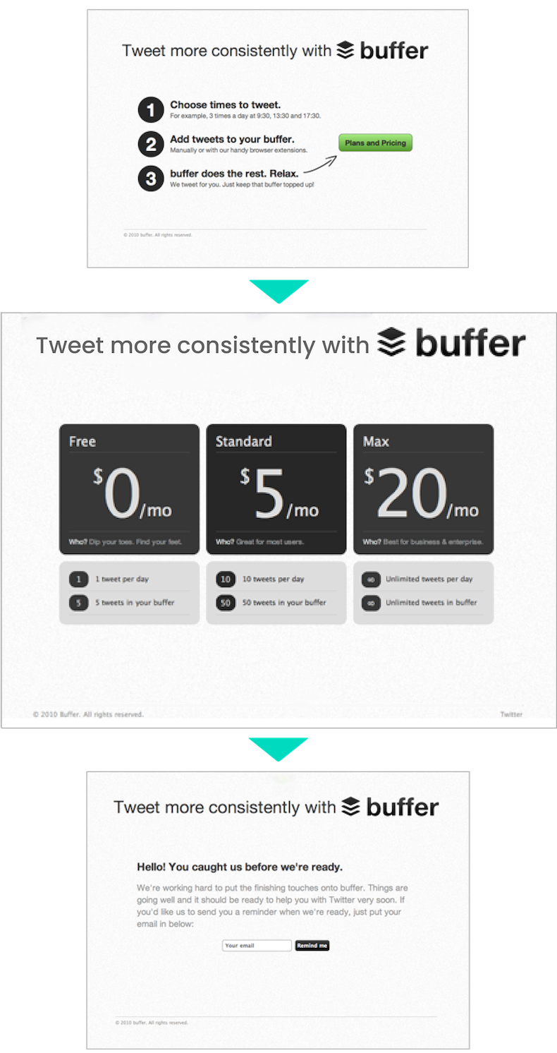
The pricing page is a variation of the smoke test. We list several price packages instead of the buy now button (or on the next screen). This allows us to validate our pricing model. Let's say $0 / month, $5 / month and $10 / month for different levels of functionality.
ATTENTION! Do not use this technique if you wish to validate the price itself. You will get false positives because of the different levels of functionality. If you'd like to determine how much users are willing to pay for your product, it's better to use A/B tests.

#2 Coming Soon Page
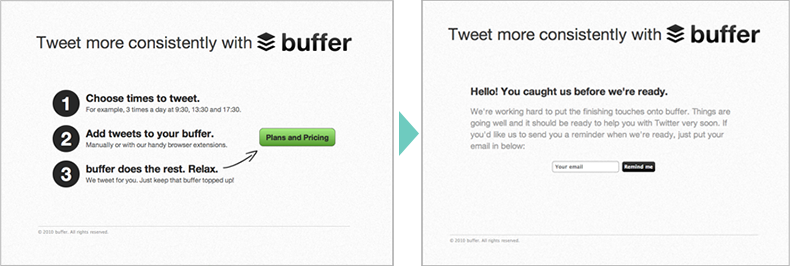
If we feel the above method to be too pushy, we could experiment with a coming soon page. A coming soon page doesn't have a buy now button. Instead, it makes it clear that the product will be available at a later time and asks users to subscribe to a newsletter if they're interested.
A coming soon page is a weaker commitment than clicking a buy now button in a smoke test. But it also has different variations, which we can use to test various assumptions.
Product Demo Video
Instead of a landing page, we could use a product demo video. This method was made famous by Drew Houston, the founder of Dropbox.
For those not familiar with Dropbox, it is a service that allows you to sync your files between your different devices. If you create a document on your laptop, it will show up on your phone. If you edit it on your phone, you'll see the change on your laptop.
Today, this seems second nature in the age of iCloud and OneDrive. But it was far from it in 2007 when the idea of Dropbox was born. Legend has it that Drew forgot to bring his USB drive on a long journey, so he couldn't make any progress on his work. Instead, he spent the time on the bus to develop Dropbox.
Building such a software product is a complex task. It's even harder to describe this product to users. Drew's first prototype was buggy and couldn't handle a large number of concurrent users (oh, and it only worked on Windows). So Drew decided to kill two birds with one stone.
He created a video that showed his prototype in action and published it on Hacker News together with a subscription form. He knew he would find the right people on Hacker News, who fit his customer profile, but he didn't know how interested they'll be in trying out Dropbox. But the subscription immediately started flowing in and Drew received enough encouragement to continue developing Dropbox.
Why was the Dropbox demo video successful? Because it managed to briefly explain a hard to grasp concept and gauge interest at the same time. Also, Drew didn't waste precious time developing a bug-free, reliable product for every platform while being uncertain about its success.
High Bar Test
The high bar test is coming soon page with a twist. We insert an additional step before registration, asking our users to complete a task, such as filling out a form. This extra step allows us to see how committed they are to getting their hands on the product, but the data collected through the form also gives us deeper insight into who they are.
Be careful with this method, though, because the more steps a registration process is, the lower our conversion rate. Always use analytics tools to measure at which stage the churn happened.
Social Payment Experiment
The purpose of the social payment experiment is to put users who registered on the coming soon page onto a waiting list, then allow them to climb the list if they share the page with their friends.
This share can be through an email invitation, social media share or simply by sharing a referral link. Every user that signs up using their referral code moves them up the list by one spot.
A social payment experiment is a great way to gauge user interest, especially if we use a viral engine of growth because it has the added benefit that it shows how viral our product is. Oh, and we'll also get some free marketing exposure.
Broken Promise Test
A broken promise test is a draconian version of the social payment experiment. In case of a broken promise test, we won't use our marketing channels to draw traffic to the landing page but invite a limited number of users (fitting our customer profile) ourselves.
We make it clear that they are now part of a secret, closed group of users on the page. However, people like to tell their friends about products they like, especially if it's something exclusive!
Soon they won't resist the urge to share our product. All that's left for us is to compare the original list of invitees with the list of current users. The difference is going to show us if our product is viral.
Pre-purchase
If we want a more substantial commitment from users than what a simple coming soon page gives us, but we don't feel like employing a smoke test, we could try a pre-purchase experiment. Users are aware that the product doesn't exist yet, but they can pre-purchase it at a knocked down price. This is a very strong commitment because they actually spent their money.
A pre-purchase page is a great method to finance production or development. But it also carries the most risk. If our product falls through for any reason, we'll be forced to pay our user back, possibly with interest.
Mock Sale
If we don't wish to carry this risk, we can tell the user, after they click the checkout button, that the transaction will only go through when the product is ready.
This method is very close to a smoke test, but it has the disadvantage that since the visitors know the product isn't ready, we'll most probably have a lower conversion rate. And unfortunately, no analytics tool will tell us exactly where we lost the visitor. Was it because he didn't like the product or because it wasn't immediately available?
#3 Crowdfunding
Validation is not what first comes to mind when discussing crowdfunding pages like Kickstarter or Indiegogo. But if we think about it a bit, we'll see we can use them exactly like a pre-purchase experiment.
Besides getting financing for our project, these pages are great to measure the level of interest in our product. Since users are willing to pay for its development, they're more likely actually to purchase it when it becomes available.
To Be Continued
Ok, this article is getting a bit longer than I expected. I only (just) covered the no product prototype, and I already hit the character limit you guys might still read 😆 .
But this also gives me the perfect opportunity to split this article into two parts (Google will love me for this). Please stick with me as I'll show you prototypes that not only present the core product features but also let users get a feel of the product.
