11 Ways to Build an MVP
This article is the second part of our article about the different types of prototypes used during product validation. If you haven't read the first part, we suggest you start with that.
Imitation prototypes
Concierge experiment
The prototypes mentioned in part one looked to answer whether we could market our product. The concierge experiment, on the other hand, answers a different question. It answers whether the proposed solution actually solves the identified users problems. This also means that this experiment is used earlier in the product development process, in the product-solution fit stage.
To run a concierge experiment, we have to choose a couple of users, who we will try to service in a way as close as possible to the user experience offered by the envisioned final product but by performing every function manually. Basically, we substitute a complicated technical solution with humans.
Naturally, this method doesn't work for any product. But, if we can deliver our value proposition to our target market with this "manual" product while also providing an acceptable user experience, it can be one of the most efficient validation tools.
The most famous concierge experiment is that of Food on the Table. But since I have already mentioned their story, I decided to look for a different example. I instantly regretted this decision since it seems every search for the concierge experiment keywords brings up Food on the Table.
After a long search which cost me my lunch break, I stumbled upon Seamless. Seamless is a food delivery service similar to Grubhub (who now owns Seamless), Doordash in the US, JustEat in Europe, or Deliveroo in the UK.
When they started in 1999, Seamless had no idea if people would prefer ordering from a food directory instead of ordering directly from the restaurant with pickup. They decided to test their hypothesis by contacting several office buildings with the opportunity for their office workers to order their lunch through Seamless.
Office managers collected the orders each day, faxed (!) them to the Seamless founders who placed the orders with the restaurants, then picked them up and delivered them to the office. When they grew to a point where they couldn't cope with the orders anymore, they knew there was a demand for their service and started software development.
Wizard of Oz prototype
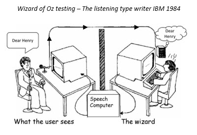
The main difference between the concierge experiment and the Wizard of Oz prototype (WoZ) is that in the case of a concierge experiment, it is evident for users that the functionality is driven by a human. With a WoZ prototype, the manual functions are hidden behind a product shell.
The WoZ prototype is one which we often use at Further, but Seamless could've also used it instead of a concierge experiment by creating a website that allows users to place orders but without any background automation.
Offers would be uploaded by the Seamless team instead of the restaurants, who would also place the orders manually towards the restaurant, while payment would only be possible at delivery. This would've been a more significant initial investment by them than the concierge experiment was, but still much cheaper than developing the complete system.

One of the most notable examples of a WoZ prototype is Zappos. We're back in 1999 again, as Nick Swinmurn was looking to buy himself a Nike Airwalk but couldn't find one in his local shoe store. As a software engineer, he immediately thought to himself, what if people could buy shoes through a webpage. Bear in mind that the answer to this question wasn't at all that obvious two decades ago.
Creating an online shoe store can get pretty expensive, pretty fast, because of the level of inventory one needs to keep. You also have to consider size replacements, return merchandise and hard to sell sizes. So before jumping in and creating one, Nick decided to test his idea.
He visited multiple stores, took photos of the shoes he believed he could sell, and then posted them on his website. When someone ordered a shoe from the website, he went to the shop, bought it, and shipped it to the customer. Obviously, this wasn't a sustainable and profitable model, but it was enough proof for Nick that there is demand for online shoe shopping.
Since the users believe they are using a finished product when using a WoZ prototype, we can use it to test not only our value proposition but also the user experience and usability of our product. Because of this, it's used primarily in the solution-product fit stage of product development.
But why is it called a Wizard of Oz prototype? In L. Frank Baum's tale, The Great Wizard of Oz, the ruler of the Land of Oz, revered by his people, is a character that is unseen for most of the story. When he does make an appearance, it is in the shape of a fairy, a giant head or a ball of fire.
At the end of the story, Toto, the dog strays from his owner and pulls a curtain away, he reveals the truth: the Wizard of Oz is just a swindler circus performer who operates the ball of fire with the help of a machine. The story is very similar to our experiment. When we finish presenting our prototype and gathering feedback, we can also reveal the humans behind the experiment.
Piecemeal prototype
A piecemeal prototype is one where we use several existing products to put together a prototype that imitates the final functionality of our product.
An excellent example of this prototype is Skillshare. Skillshare is an online tuition platform similar to Udemy or Coursera. This type of platform is very popular nowadays, but in 2011 when Malcolm Ong and Michael Karnjanaprakorn (I'm just going to stick to M&M from here on) started Skillshare, it was quite a novel idea.
But since it was a novel idea and there weren't any similar products on the market, M&M were unsure if people would be willing to pay for courses that are not by a university professor or otherwise accredited by an educational institution. Before they started building their educational marketplace, M&M decided to test.
They created a simple landing page that listed the courses. To make it possible to buy these courses, they uploaded each one as an event on Eventbrite, a service that allows people to buy tickets for shows, concerts, conferences or, in this case, courses.
M&M managed to prove their concept with the help of a simple landing page builder and a 3rd party service without writing a single piece of code.
Low-fidelity prototypes
Paper prototypes
Although their primary purpose is different, we can use blueprints, technical drawings, and even hand-drawn sketches to validate an idea. We don't show a house to the buyer when it's already built. Instead, we first create floor plans to validate if internal spaces' division and functions are right.
Fashion designers don't start creating a new dress by choosing a fabric and cutting it up. Instead, they draw sketches, show them to a focus group and collect feedback.
The rough representations of a product are called low-fidelity prototypes.
Wireframes
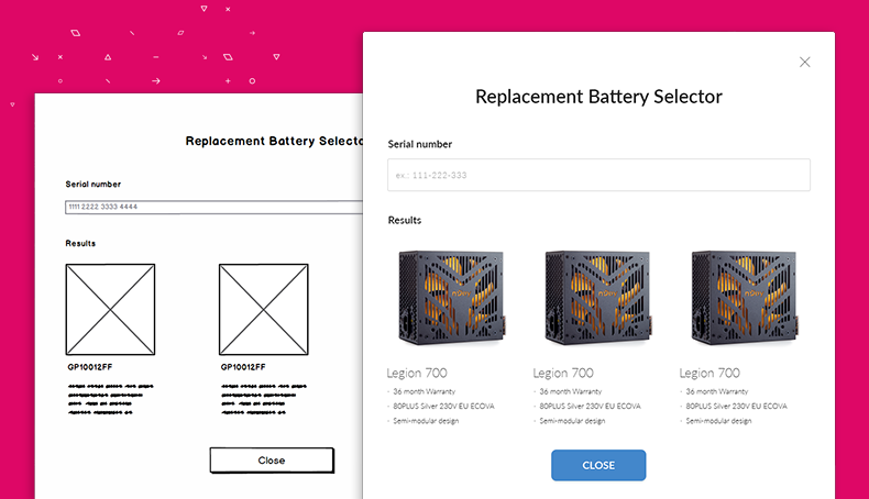
Wireframes are the best known low-fidelity prototypes, especially in the case of digital products. They are basically black and white representations of a user interface, consisting of simple lines and shapes. Wireframes are an incredibly efficient way to illustrate the positioning and hierarchy of elements within a page and give users a feel of the product as they would use it.
Some of the tools you can use to create wireframes are Balsamiq, UXPin or Miro.

High-fidelity prototypes
Interactive mockup
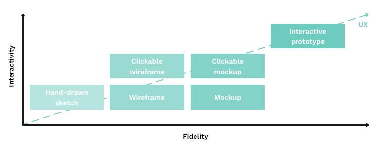
High-fidelity prototypes are refined versions of low-fidelity prototypes. The high-fidelity prototype often encountered is the mockup. In the case of a digital product, the mockup will be the actual UI design. These mockups can have various levels of interactivity. In their most basic form, they aren't interactive at all. The UI design is nothing but an image.
The minimal interaction we can introduce is clickability, meaning that a new page floats in whenever we click a link or a button. This might seem like a minor feature, but it's a huge step forward since it allows users to grasp the flow of the software.
We can further advance interactivity by introducing animations or showing how users can interact with forms (e.g. making an input red if they provide an unacceptable value).
You can create interactive prototypes with the help of tools such as Figma, Sketch, Invision or Adobe XD.
It's always worth considering where we want to place our prototypes on the fidelity and interactivity scale. The higher the fidelity and interactivity, the more accurate the picture we'll be able to give the users of the proposed user experience, and the more relevant their feedback will be. The ratio between the invested energy and resources versus the amount of knowledge to be gained will be the deciding factor.
I prefer starting with a non-clickable wireframe and putting it through the build-measure-learn loop once. I use the experiences of this test to then build a clickable mockup, which I iterate until I get the feedback that I have achieved the desired user experience.

Pocket prototype
A reduced-size or miniature representation of a product is called a pocket prototype. Since pocket prototypes are much cheaper to create than the final product but deliver a similar user experience, they efficiently validate physical products.
Single-feature prototype
The Pareto principle states that 80% of the consequences come from just 20% of the causes. This 80/20 rule also applies to products. 80% of the added value stems from 20% of the functionality. This is the basis of the single-feature prototype.
Search for the one central function which brings the most value to users, build it and test it. Since we're only solving a single user pain point, this prototype is also called one painkiller prototype.
The founders of Spotify, Daniel Ek and Martin Lorentzon, wanted to solve the problem of illegal music piracy. The basic premise was that music publishers could make money by royalties from subscription fees instead of selling records.
What they didn't know was if users would be willing to pay for a streaming service since streaming was notoriously unreliable back in those days.
"We spent an insane amount of time focusing on latency when no one cared because we were hell-bent on making it feel like you had all the world's music on your hard drive." — Daniel Ek, Spotify founder.
Afterword
As we've seen, we can use the above prototypes to validate our value proposition, test the user experience of our product or gauge market demand. But we should only employ them once our problem has already been validated and we have set up the right metrics. Stay with me as we dive into these metrics and more product development and startup related topics!
