Wireframing Essentials: First Steps to Creating a Wireframe
Wireframing is a fundamental step in creating successful digital products, whether it's a website, mobile app, or any other interface. This process helps you outline the structure and functionality of your design, providing a clear roadmap before diving into the details.
What is a wireframe?
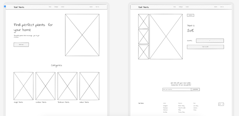
A wireframe is a visual blueprint of a web page, software or app screen. It provides a skeletal outline of the page's layout, focusing on the arrangement of elements such as navigation menus, buttons, images, and text. Unlike the final design, wireframes are simple and devoid of any design elements such as colors, fonts, or images. Think of them as the architectural plan of your digital project, outlining its functionality and structure.

Why are wireframes important?
Wireframes serve several crucial purposes in the design process:
1. Visualize the layout: Wireframes allow you to see the basic structure of your design without being distracted by colors or graphics. This helps you focus on the layout and functionality of your project.
Example: If you're developing a mobile application for a fitness tracking system, your wireframe might include screens for tracking real-time workout statistics, viewing historical data, setting fitness goals, and receiving health tips. This layout would show the placement of buttons, menus, graphs, and notifications, ensuring an intuitive and functional user experience.
2. Identify usability issues: By creating a wireframe, you can identify potential usability issues early in the design process. This allows you to make changes and improvements before investing time and resources into detailed design and development.
Example: While creating a wireframe for your fitness tracking app, you notice that the progress graphs are too small to be easily readable. By identifying this issue early on, you can redesign the layout to make these graphs more prominent and user-friendly.
3. Communicate ideas: Wireframes are an excellent way to communicate your design ideas to clients, stakeholders, and team members. They provide a clear, visual representation of your vision for the project, making it easier for others to understand and provide feedback.
Example: You present your wireframe to your development team to discuss the layout and functionality of the fitness tracking app. The wireframe helps everyone visualize how the app will work and allows for productive discussions about potential improvements and enhancements.

How Wireframes Are Created?
Now that you understand the importance of wireframing, let's take a look at how wireframes are created:
1. Define the Purpose and Goals of Your Project: Before you start wireframing, it's essential to have a clear understanding of the purpose and goals of your project. For your fitness tracking app, the goal might be to provide users with real-time workout statistics and personalized health tips.
Example: Define the key features and functionalities of your app, such as tracking steps, monitoring heart rate, logging workouts, and providing personalized health insights.
2. Gather your materials: To create a wireframe, you'll need some basic materials such as pen and paper, a whiteboard and markers, or a digital wireframing tool. Choose the method that works best for you and your team.
Example: If you prefer a digital approach, tools like Balsamiq, UXPin, or MockFlow are popular choices for creating wireframes. These tools allow you to easily drag and drop elements to create a detailed wireframe of your design.
3. Start with a rough sketch: Begin by sketching out a rough outline of your design. Focus on the layout and placement of key elements such as navigation menus, buttons, and content areas. Don't worry about making it perfect at this stage – the goal is to quickly capture your ideas and get them down on paper.
Example: Sketch a rough layout of the app's home screen, including where you want to place elements such as the workout statistics, navigation menu, user profile icon, and tips section.
4. Refine your design: Once you have a rough sketch, take some time to refine and iterate on your design. Show it to users, gather feedback and make adjustments as needed to improve the layout and usability of your wireframe. You may find it helpful to create multiple versions of your wireframe to explore different design options.
Example: Experiment with different layouts and arrangements of elements to see what works best for your project. For instance, you might try placing the workout statistics at the top of the screen or in a dedicated section to make them more accessible to users.
5. Add annotations: Finally, add annotations to your wireframe to provide additional context and information. This could include notes about the functionality of specific elements, as well as any other important details that need to be communicated to your team or clients..
Example: Add notes to your wireframe explaining the purpose of each element and how it will function. For instance, you might add a note to the workout statistics section explaining that it will update in real-time based on user activity and provide feedback on their progress.

Different Types of Wireframes
Wireframes come in various formats, each serving a different purpose in the design process. Here are some common types of wireframes you may encounter:
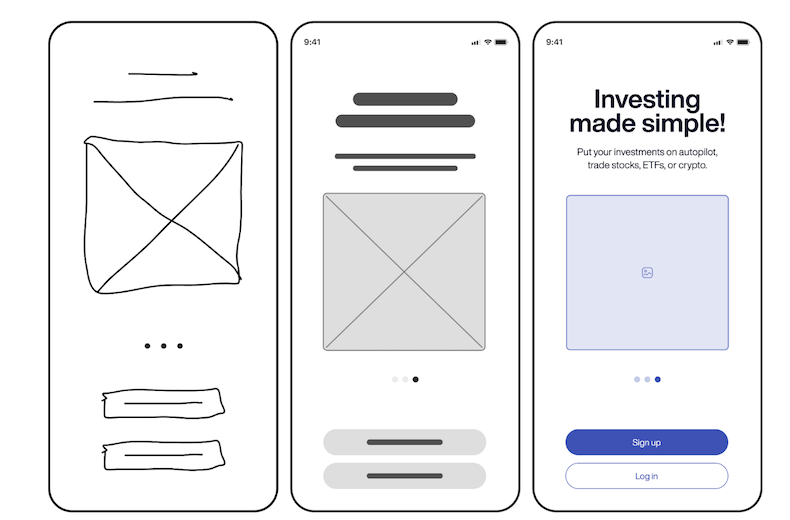
Low-fidelity wireframes: Also known as "sketches" or "low-fi wireframes," these are quick and simple representations of a design. They focus on the basic layout and structure of a page without going into detail. Low-fidelity wireframes are often used in the early stages of a project to explore different ideas and concepts.
Example: A low-fidelity wireframe of a mobile app home screen, showing the placement of key elements such as the navigation menu, search bar, and content sections.
2. High-fidelity wireframes: High-fidelity wireframes are highly detailed and closely resemble the final design. They include visual design elements such as colors, fonts, and images, as well as more detailed information about the functionality of elements.
Example: A high-fidelity wireframe of a mobile app screen, showing the final design with visual elements such as colors, images, and detailed typography.
3. Interactive prototypes: Interactive prototypes are wireframes that include interactive elements such as buttons, links, and dropdown menus. They allow users to interact with the design and experience how it will work in a real-world setting.
Example: An interactive prototype of a web application, allowing users to click on buttons and links to navigate through different screens and experience the app's functionality.

Choosing the Right Type of Wireframe
The type of wireframe you choose will depend on your project's needs and where you are in the design process. Here are some factors to consider when selecting the right type of wireframe:
- Project stage: in the early stages of a project, low-fidelity wireframes are often used to quickly explore different ideas and concepts. As the project progresses and more details are finalized, you may move on to mid-fidelity or high-fidelity wireframes to provide a more detailed representation of the final design.
- Audience: consider who will be viewing your wireframe and what level of detail they need. For example, if you're presenting your wireframe to stakeholders who may not be familiar with design concepts, a high-fidelity wireframe with visual design elements may be more effective.
- Feedback: remember that wireframing is an iterative process, and you may need to create multiple versions of your wireframe as you refine your design. Choose a wireframe type that allows for easy iteration and modification as per feedback.
When to Use Wireframes?
Wireframing takes place early in the project lifecycle, often at the beginning of the design phase. It is an essential step in the User-Centered Design process, allowing designers to create a blueprint of the user interface before moving on to more detailed design elements. Here are some key points about when wireframing is used:
1. Early design phases:
Wireframing is one of the first steps in the design process. It allows designers to quickly sketch out the basic layout and structure of a web page or app screen, focusing on the placement of key elements such as navigation menus, buttons, and content areas.
2. As part of the User-Centered Design Process:
Wireframes are an integral part of the User-Centered Design process, which focuses on designing products that meet the needs and preferences of users. By creating wireframes early in the design process, designers can ensure that the final product is user-friendly and intuitive.
3. Usability testing:
Wireframes are often used in prototype usability testing to gather feedback from users before moving on to the creative process. Prototype usability tests allow designers to identify any usability issues early in the design process, making it easier to make changes and improvements before investing time and resources into detailed design and development.
Example: Before starting the creative process, designers create wireframe pages and conduct usability tests with target users. These tests help identify any usability issues or areas for improvement in the early stages of the project.
