How to Measure the Success of Your Startup?
It is entirely natural to use different research tools and metrics before launching a product than after the launch. In our series about startups and lean product development, we have learned about validation and creating prototypes. We don't have any clients in these early stages yet, so we mostly use qualitative research methods to get feedback for our product.
We can, of course, continue to use these even after product launch, but now we can also employ quantitative methods such as A/B testing or analytics. Today, we're going to take a closer look at how we can use analytics to gauge the success of our product and how we can use them to improve our business model.
Analytics
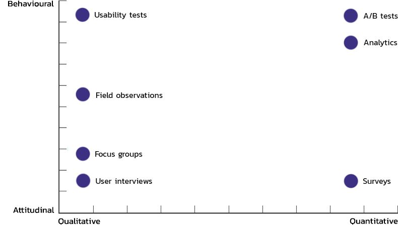
As you can see from the figure above, analytics is a quantitative method. A quantitative approach means that we can easily compile behavioural data from multiple users into a comparable statistic.
It is also a behavioural method. This means that it is based on actual user behaviour, and you don't have to worry about users behaving differently from what they said during the interviews.
Analytics frameworks
There is countless analytics that can help us measure the performance of our product. Trying to follow and improve all of these analytics is borderline impossible. It helps set up a framework that clarifies how each metric ties into the greater picture and which one we should focus on.
Analytics for Pirates
Dave McClure, the founder of 500 Startups, an investment fund and accelerator for startups, introduced his "Startup Metrics for Pirates" framework at a conference in 2007. Dave differentiated 5 macro metrics that each startup must focus on:
- Acquisition — how we make people aware of our product
- Activation — how we transform interested leads into customers
- Retention — how we retain customers (or how we make them purchase again)
- Referral — how we make customers refer our product to others
- Revenue — how we maximise the revenue we get from a customer
Put the first letters of thee five words together, and it becomes apparent how pirates come into play — AARRR!
Based on where we're at in our product lifecycle, one of these 5 metrics will always be more important than the others. This is going to be our focus metric. The focus metric should always be the one that brings the highest return on investment (ROI).
With time, as we improve our focus metric, further improvements will generate a lower ROI, and another metric will become our focus. There is a natural order to focus metrics when developing a new product.
Focus on retention first
Working on a new product means we're still looking for product-market fit. This means we're still not confident that we'll bring enough value to our customers for them to pay for it.
This also means that we shouldn't invest energy in bringing in more leads onboard. We also shouldn't concentrate on improving our conversion rates. Acquisition and activation will have minimal, if any, impact on our business at this point since it is highly likely that we're going to lose these customers sooner or later.
Instead, we should concentrate on holding onto the few users we already have. Our churn rate shows how well we're retaining customers, which is the percentage of customers we lost over a period of time. We can also use a retention curve.
To calculate these, we need to know the following micro metrics:
- new users gained for a period of time
- the number of users active for that same period of time
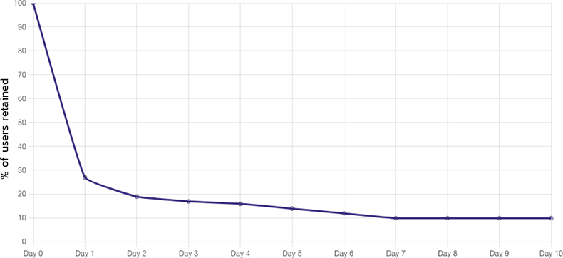
The horizontal axis of the retention curve shows the time elapsed, while the vertical axis shows the percentage of returning users, which we get by dividing the aforementioned micro metrics. The curve always starts at 100% on day 0.
We can immediately notice a sharp drop on day 1. The percentage of active users drops from 100% to 27% on the graph above. The sharper the decline, the weaker our product-market fit. Bear in mind, though, that this initial drop-off rate, as it's called, may vary significantly for different product categories.
The curve above is for a mobile app. Sharp drop-off rates are natural for an app. Mobile users install countless apps each day, most of them are never opened again. The app icon is lost in a sea of icons. We can diminish this effect by using push notifications, for example.
Another essential feature of the retention curve is the rate of decline after day 1. Sooner or later, each curve will flatten out. Our final retention rate is at 10% on the graph above, meaning that our churn rate is 90%.
An average monthly churn rate for a SaaS product is between 3-8%. Yearly, this figure is at 32%-50%. We can focus on refining our initial drop-off rate and rate of decline separately to minimise our churn rate.
When calculating retention rates, it's important to consider the length of the period we're investigating. For a product meant to be used daily, such as Spotify or Netflix, it's worth using a daily granularity, such as on the example graph above. Weekly granularity might be enough for GPS navigation software, as users don't necessarily need to navigate while driving each day. Whereas for a plant recognition software such as PlantNet, which is used on an ad hoc basis, we might visualise data on a monthly scale.
We can also use retention rates for hardware or physical products, not just software. More and more hardware products are accompanied by a subscription-based digital service (such as a fitness app for fitness watches). But we can also extend it to product loyalty: is our product valuable enough for users to purchase a newer model?
Activation before acquisition
After achieving a healthy retention rate, we can be sure that if we gain active customers, we'll keep hold of them for an extended time.
Great. So on to generate as many leads as we can get, right? Not quite. Generating leads is a futile effort because these leads won't become customers if we don't work on our conversion rates. On top of that, it's going to be even harder to activate them again later.
Our next focus metric should be activation or improving our conversion rate. By focusing on conversion rates now, we'll achieve a much better ROI when tinkering with acquisition later on.
If we use PPC ads and landing pages to sell our product, we might run A/B or multivariate tests. An A/B test means that we take our landing pages and ads, creating multiple versions of them. These variations may differ in copy, design or layout. We then show these variations to our users in equal proportions. The ones which perform better and generate superior conversion rates are the ones we should concentrate on and polish further.
A reasonable conversion rate for a SaaS product is around 3%, but this depends on the actual product and the pricing.
Software that provides free trials without requiring credit card details up front (no credit card required) have an 8-10% chance to convert users into paying customers, while those that do require card details have a conversion rate of around 25%. For a freemium product, this rate can be 4% (Dropbox) or 30% (Slack).
We should also consider that roughly 8-10% of leads turn into trial or freemium users. So the combined conversion rate will still be between 1-3%.
Improving acquisition
Once we optimise retention and activation, we can move on to acquisition. While improving our acquisition macro metric, we're looking for new and better ways to generate leads and increase awareness of our product.
Together with the conversion rate, the cost associated with generating a lead will give us one of our most critical micro metrics, the customer acquisition cost (CAC). If 1000 landing page impressions cost us $100, and we have a conversion rate of 2.5%, our CAC will equate to $4.
Sticking to the example above, while fine-tuning our acquisitions, we must strive to lower our CPM — cost per 1000 impressions. An impression might come from many sources: newsletters, pay-per-click ads, free webinars, speaking engagements, PR articles, etc. We can calculate our CPM by dividing the total number of impressions generated throughout our sales funnels by the total cost to set up our sales funnels. Multiply this number by 1000.
Cohorts
Before wrapping up, I'd like to make a quick note on cohort analysis. A cohort is a set of users grouped based on a common characteristic. This can be geographical location or the date they installed an app.
Why are cohorts important?
Cohorts are used to make comparing data more accessible. If Jane installed an app weeks after Timothy, she would relate differently to that app since she can already use all the features developed since Tim started using the app.
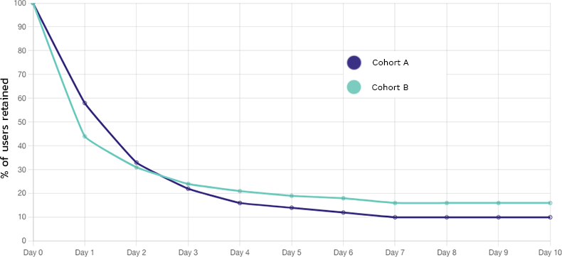
On the above graph, we can see the retention curve of 2 cohorts. Cohort A has the lowest initial drop-off rate but the fastest decrease. Cohort B has a steeper drop-off but a slighter decrease.
Since the terminal retention rate of cohort B is higher, it will generate more significant revenue in the long run.
Cohort analysis helps diffuse the confusion which arises from running multiple campaigns and optimisations in parallel.
Afterword
During the last eight articles, we took a deep dive into the steps of lean product development. We looked at validation tools, prototypes and metrics. Through the example of our micromobility gadget, we even simulated the entire process. In the upcoming weeks, I wish to bring you even more practical examples through a couple of case studies. Stick around!