The Story Behind Our Rebranding
Rebranding is always a scary and bold move from a company, since we all know how much we do not like change as humans. When the rebranding idea comes up within an organization people usually embrace the change, but in the meantime they are full of doubts and questions: Will it be good enough? Will it deliver the message we are trying to send? Will our customers like it? What will their response be? The questions are just infinite when it comes to rebranding.
We took the shot and decided to rebrand our company not only because change is necessary to grow, but the main reason behind the rebrand was that the old one did not represent us well anymore. We are certain that this is a good enough reason for any company to rebrand, as this is the first line of communication we establish with a customer.
We did not know exactly what we wanted in the beginning. The only thing we did know was the brand personality we would like to convey to our customers: professional, serious and innovative but in the meantime it should also be personable and approachable.
Choosing the right brand name
We agreed that C4studio was no longer a clear representation of what we do and the company we became. The name was the hardest part, as we realized that us people are so similar yet so different. We came up with a bunch of new name ideas, but it seemed that what one name meant for a colleague it meant something completely different to another.
We realized after a while, that it has to be a name that sends a clear message and that is why we decided on Further Digital Solutions. We always strive to evolve and develop ourselves, and to help our customers organize and automate their company with quality custom software solutions. We are a partner to help organizations go Further.

Designing a new visual identity
Our old logo was bold, playful and young, and last but not least, it was magenta. We loved it and were sad to see it go. However, it was a logo created in the beginning of our journey in 2010. It represented a bunch of young, high-energy people who wanted to create something big.
We are the same people, full of passion towards what we do, that is why you will experience some of this perky magenta here and there in our new design. We did not give that youthful part of us away, it is just the concept and our place on the market that has changed. We grew, we learned, we evolved, and felt that our visuals needed to represent that a little more.
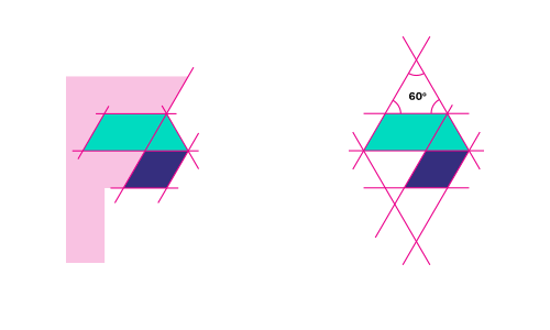
The arrow shape was the most obvious way to represent the concept of going further, but we hid the 'F' initial in the negative space of the logo-mark.

The cobalt blue and pearl green was chosen since it represents exactly what we would like to broadcast to our customers. It represents professionalism, that we are serious about the trust our customers put in us. Belief, that we are doing everything in our power to make our clients satisfied and happy. Approachability, as we are happy to discuss, ideate and collaborate with our clients continuously to create a perfectly functioning system based on their needs and requirements.
We are very happy with the result; we truly hope that you are too. We believe that by this new look we can represent what we truly believe in and show the world our passion towards software solutions and great service. Let's say goodbye to our old look together and keep going further together.
Be efficient. Get organized. Go Further.
Special thanks to Zsolt and Balu for assisting us throughout the rebranding process. Next beer is on us!
